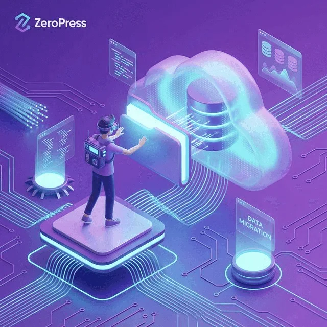
You’ve migrated your database to Markdown and your site is hosted on Cloudflare’s Edge Network. Your server response times are practically zero. However, if you upload a 5MB unoptimized PNG as your hero image, your site will still load slowly.
Images account for over 50% of the weight of an average web page. In a ZeroPress architecture, image optimization happens before the user ever loads the page.
The Problem with WordPress Image Optimization
In WordPress, you typically rely on plugins (like Smush or WebP Express) to optimize images on the fly.
These plugins require PHP processing power. When a user requests an image, the server might have to compress it, convert it, and serve it. This consumes server resources, increases hosting costs, and slows down the first few visitors to a page.
The ZeroPress Approach: Build-Time Optimization
In a static site, there is no server processing an image on demand. The image must be perfectly optimized before it is uploaded to the CDN.
ZeroPress handles this automatically via its Node.js and sharp plugin architecture during the build step.
1. Automatic WebP Conversion
The WebP format provides superior lossless and lossy compression for images on the web. Using WebP, webmasters and web developers can create smaller, richer images that make the web faster.
WebP lossless images are 26% smaller in size compared to PNGs. WebP lossy images are 25-34% smaller than comparable JPEG images.
If you place a 3MB hero-image.jpg into your ZeroPress assets/images/ folder, the build process automatically generates a heavily optimized hero-image.webp file, often reducing the size to 200KB or less without visible quality loss.
2. The Power of srcset
Serving a WebP image is great, but serving a 2000px wide WebP image to a user on a small 375px wide iPhone screen is still a waste of bandwidth.
Modern browsers support the srcset attribute. This allows you to provide multiple sizes of an image and let the browser decide which one to download based on the device’s screen size and resolution.
In a ZeroPress Jekyll theme, we achieve this automatically using picture elements:
<picture>
  <source srcset="/images/hero-small.webp 400w, /images/hero-large.webp 1200w" type="image/webp">
  <img src="/images/hero-fallback.webp" alt="A perfectly optimized hero image">
</picture>
Our engine automatically scales your original uploaded image into these smaller breakpoints, dramatically improving load times on mobile devices.
Best Practices for Content Creators
While the system automates the heavy lifting, editors using the Sveltia CMS should still follow best practices:
- Never upload print-resolution images: Try to keep original uploads under 2000px wide.
- Use descriptive filenames: Rename
IMG_4815.jpgtozeropress-migration-dashboard.jpgbefore uploading. This helps SEO. - Always write Alt Text: Every image should have an
alt="Description of image"tag for accessibility and image search indexing.
By letting ZeroPress handle the conversion and resizing locally before deploying to the global CDN, you guarantee 100/100 Google PageSpeed scores and easily pass your Core Web Vitals.